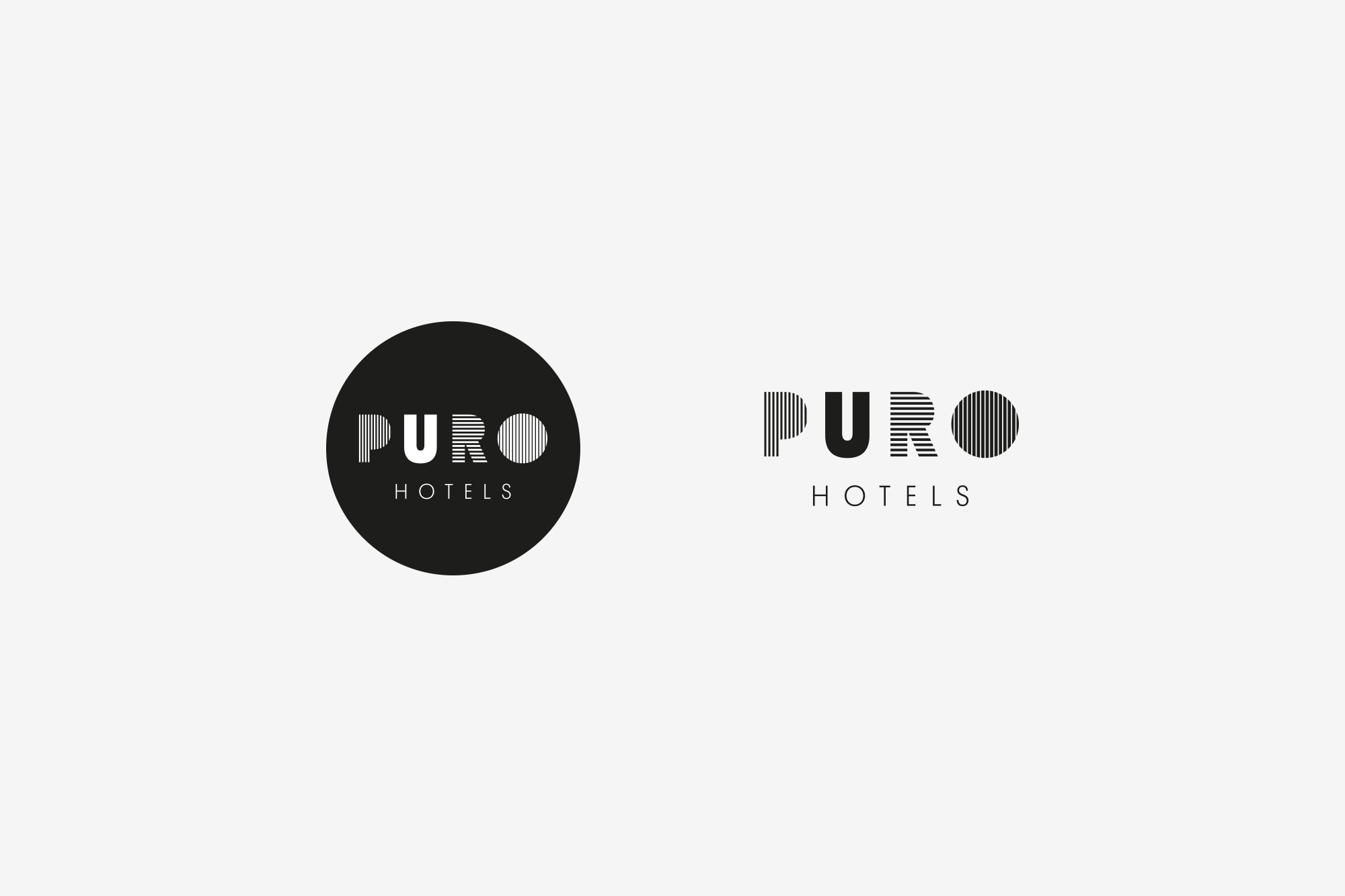
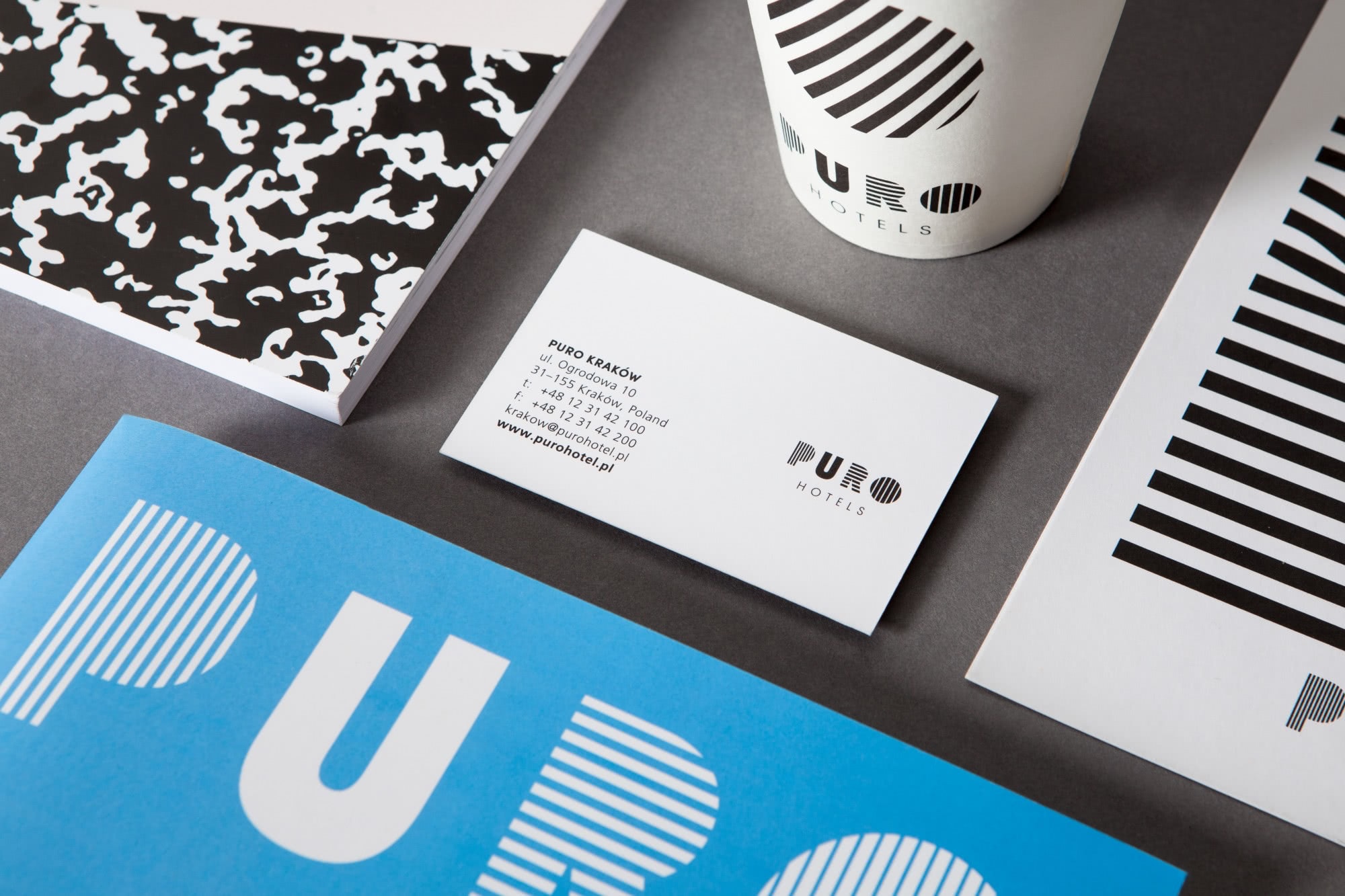
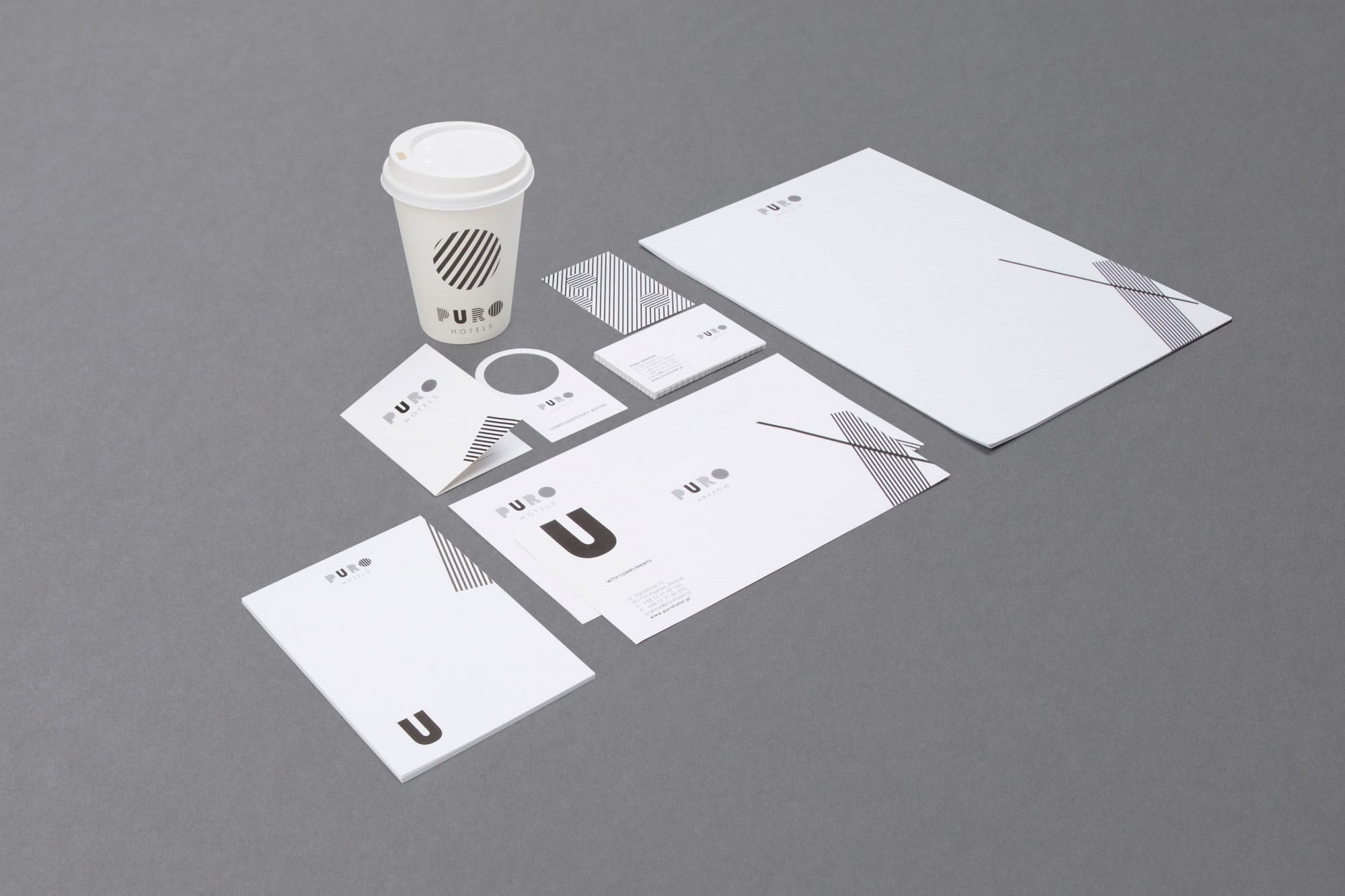
We deployed vibrant black and white stripes to suggest the fresh and exciting path through the city that PURO offers its guests. We designed a distinctive bold U in the centre to speak directly to the guest and amplify the message that they are at the heart of PURO’s offer.
The bold logo design and broader graphic development symbolise the brand’s embracing of progressiveness and constant evolution. Creative and coherent, the overarching brand identity was devised to be instantly recognisable.
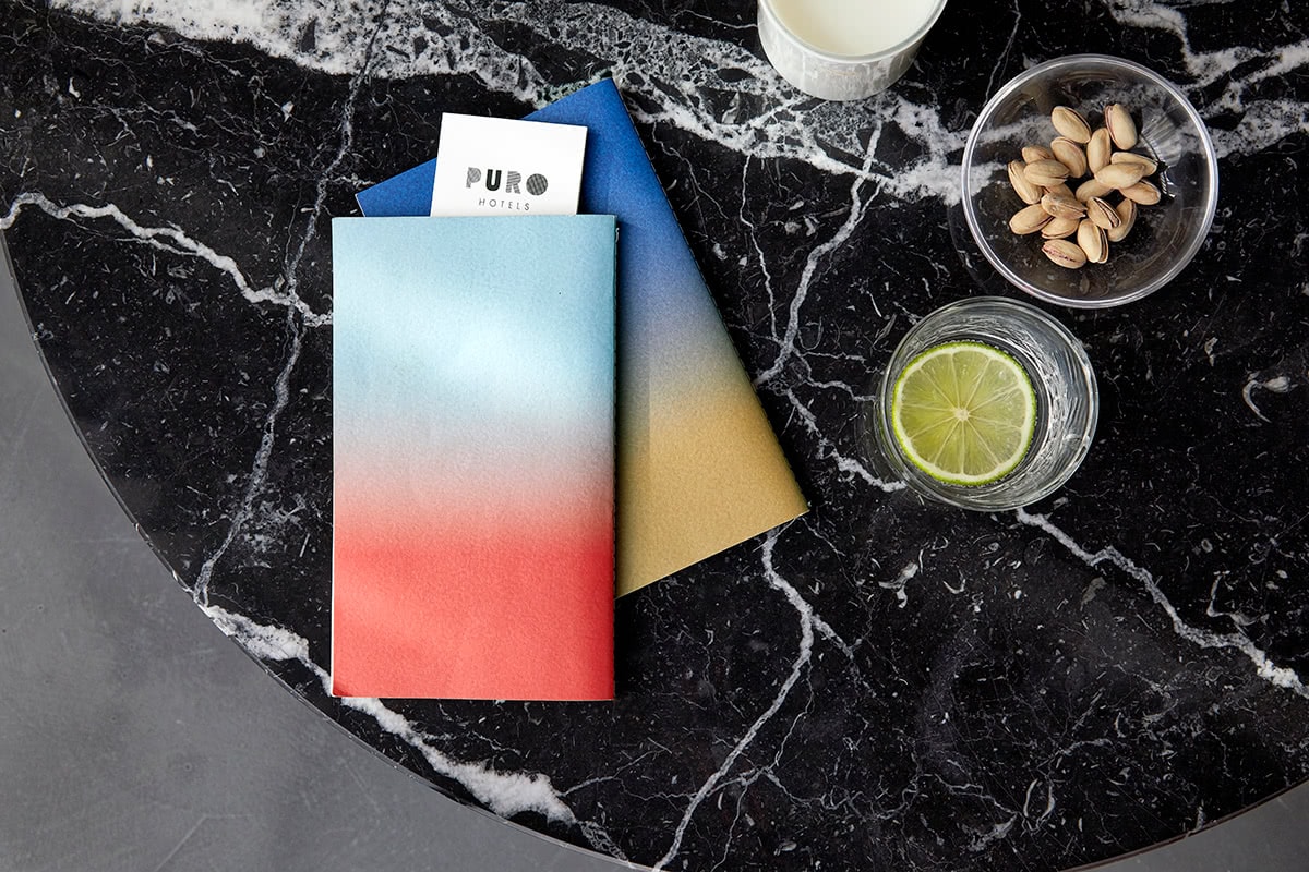
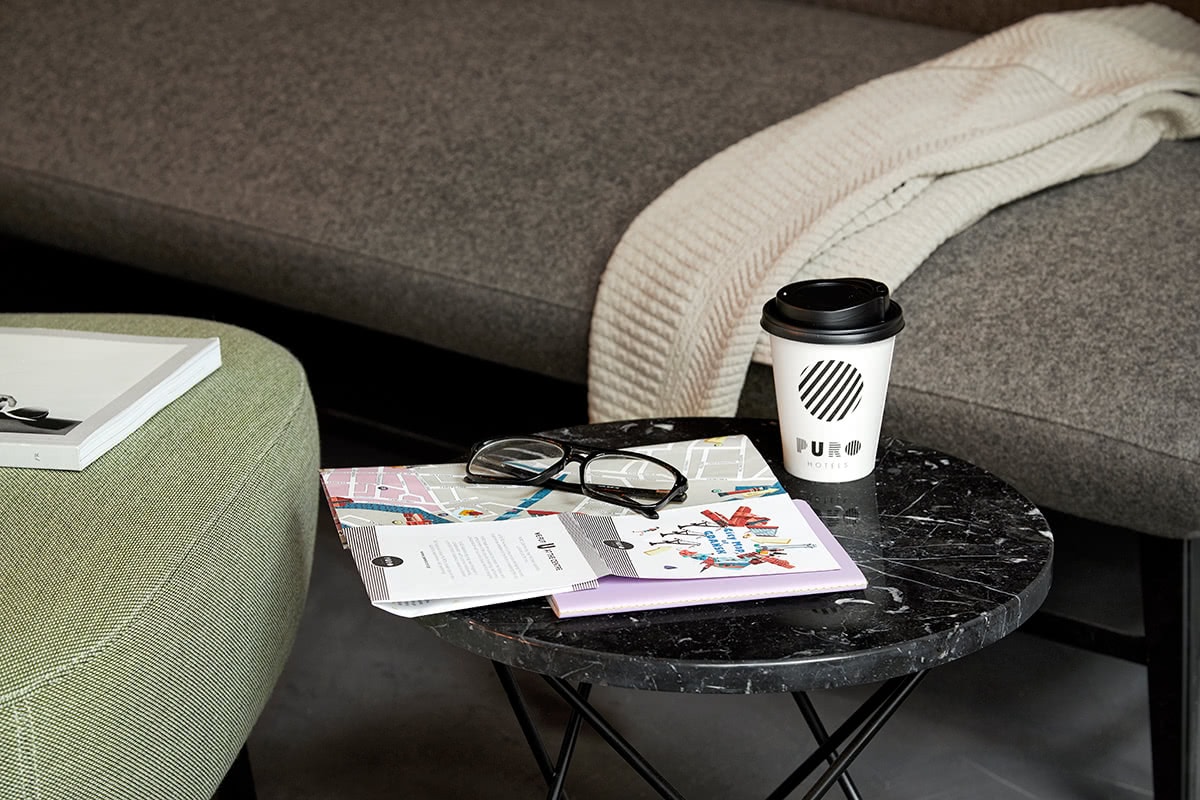
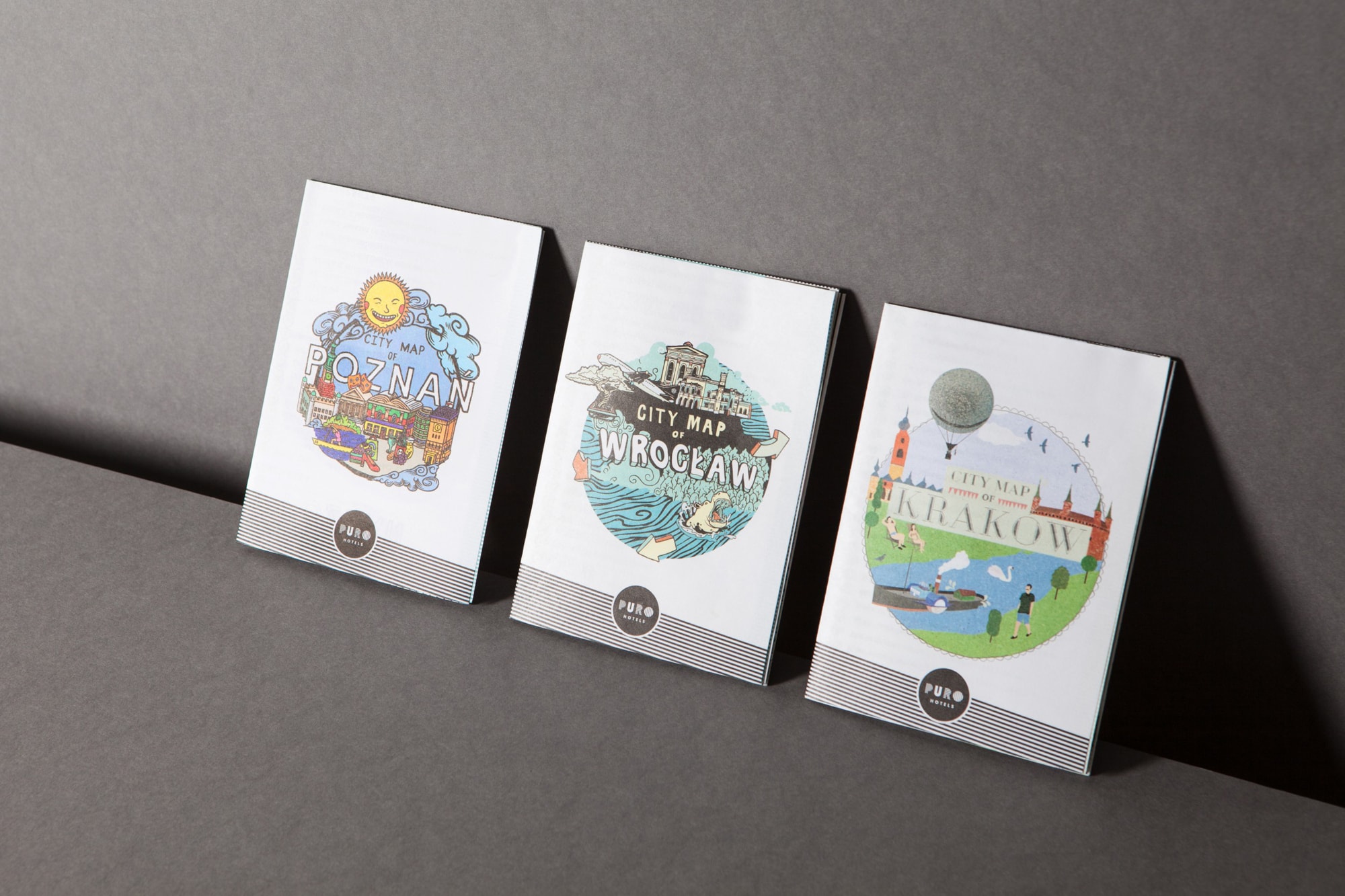
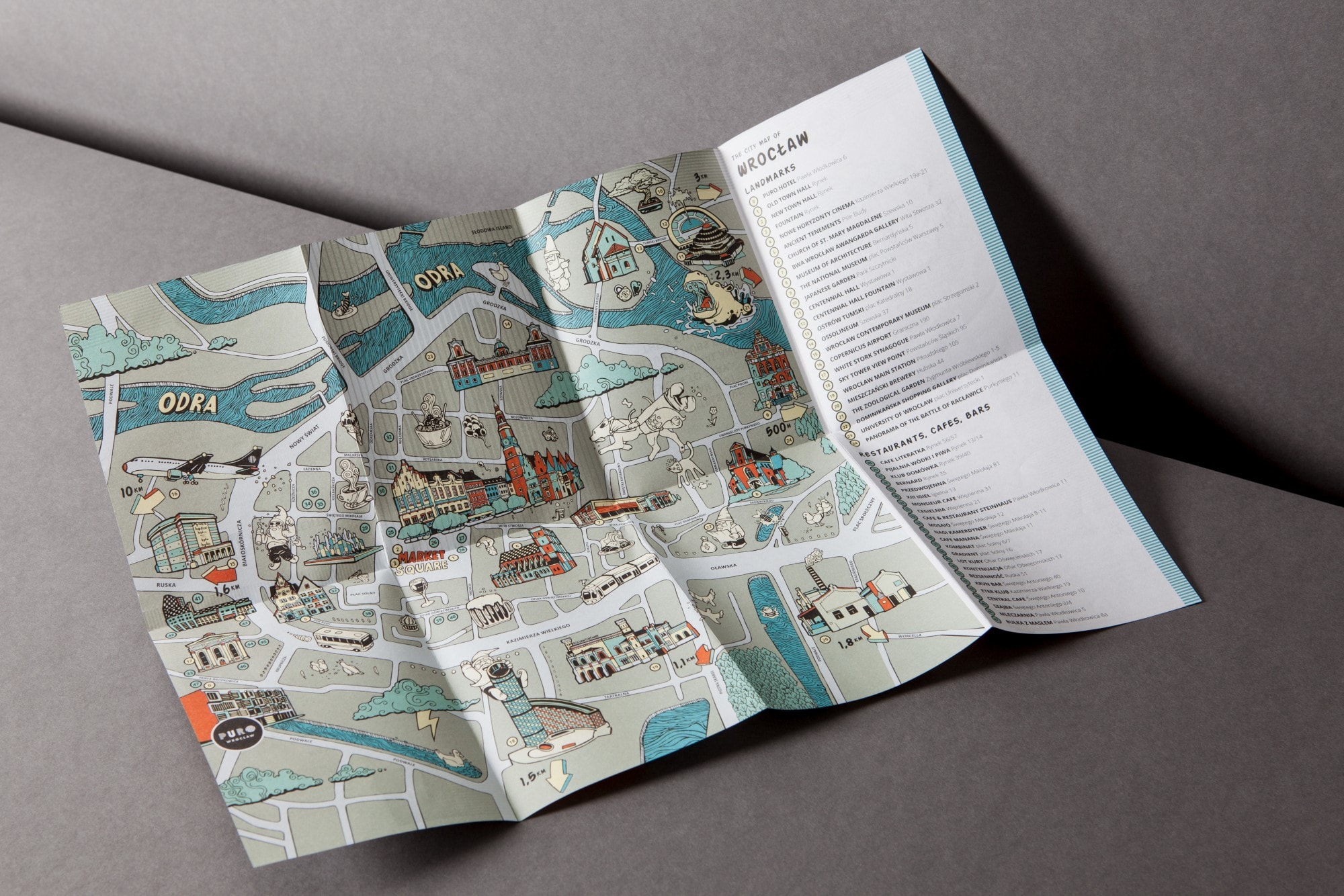
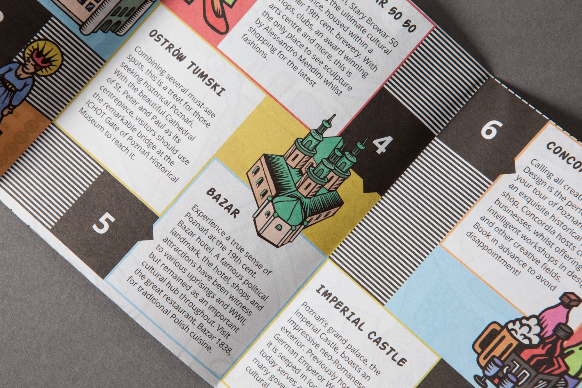
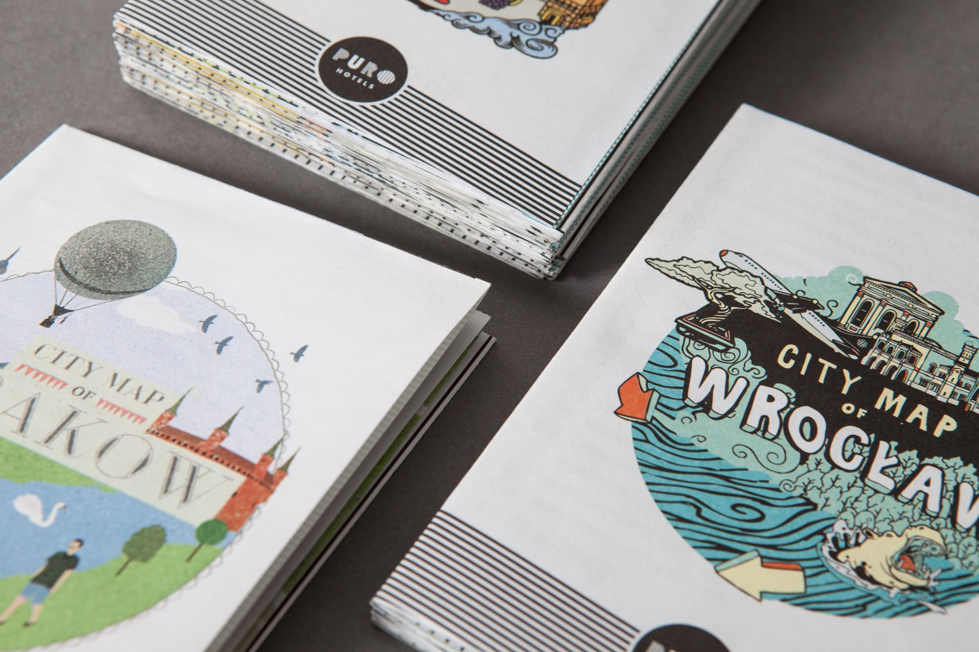
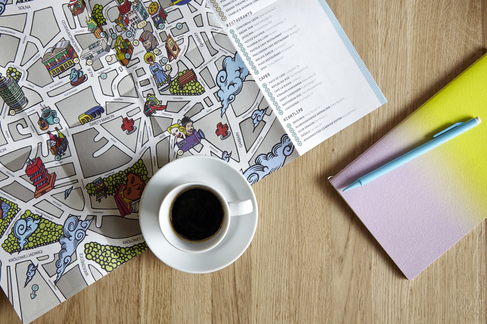
We also produced a series of PURO-specific, pocket-sized city maps – made in collaboration with local illustration artists – designed to reflect PURO Hotels’ role as a hub of experiences.
Role
Branding, identity design, maps concept and design